
One of the most common items used for business promotions is the humble t-shirt. It’s fairly cheap, has a practical use, and can easily be personalised. However, since many companies aren’t into design, they fail when it comes to making the right call on how the shirts should look.
Avoid these turn-offs when you are coming up with your concept.
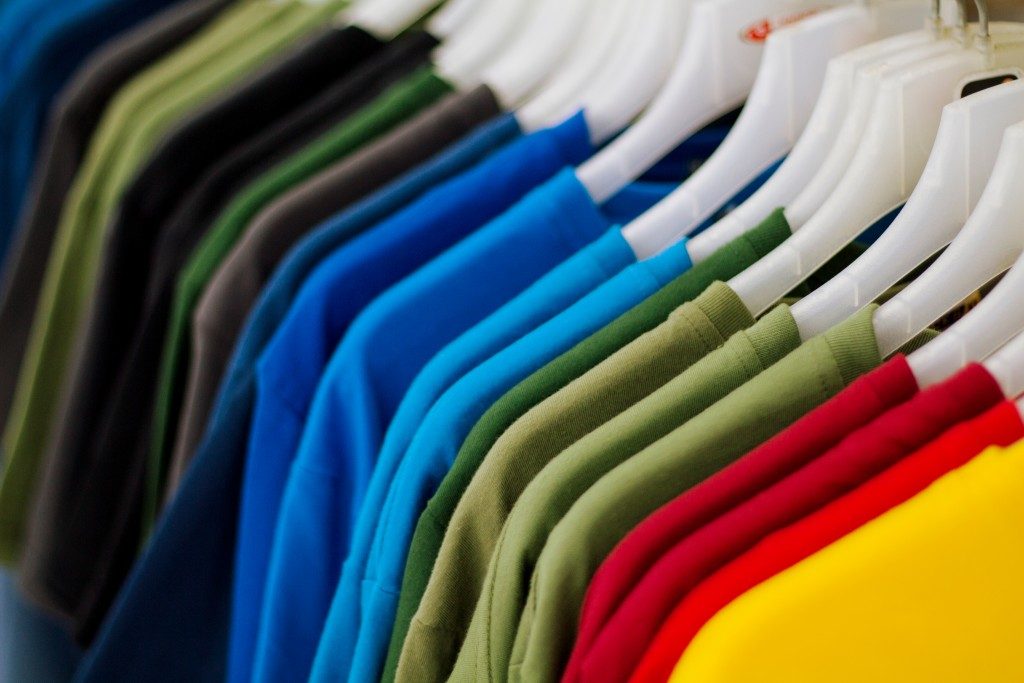
Low-Quality Material
It might just be promotional clothing or apparel to you, but your giveaway shirts can still be judged by your customers based on the quality of the material. They can understand that you’d want to cut costs since you’re not putting them on sale, but they don’t want it made obvious by how thin, itchy, or rough the shirts are.
You’re not giving them rags. So you might want to take a little bit more time in choosing a comfortable material that’s still easy on the budget.
Painful Colour Scheme
Now that we have got the material of the shirt down, let’s talk about the design itself. One of the biggest mistakes that people, not just companies, make is not going with an appropriate colour scheme. The ways in which it is committed vary, from choosing too many colours to making it too loud, to going too subtle.
An easy way to deal with it is to base the scheme from your company logo, which is most likely designed professionally, and then work from there.
Difficult to Read

Using text is a simple way to design a shirt, but it’s not necessarily an easy way. First of all, you would need a catchy phrase that will describe you and that other people will be proud to display on their person. Next, it would have to be designed in a way that would look interesting and be easy to read. Unfortunately, people fail in the design part, often using a boring font, too many fonts, or unusual but awkward arrangement of words, to name a few. Make sure to pick only a few eye-catching fonts that work together in a good size and a readable layout.
Blurry Images
Pictures always draw attention, often even more so than text does. However, people often make the mistake of providing images that have a low resolution or in the wrong format, getting shirt prints that are pixelated or have unnecessary elements.
As much as possible, any pictures should be in the size that you’re going to print them in, at least 200 dpi, and in the correct format. For example, if your image needs to have a transparent background, it should be in the PNG format.
As you may conclude from these points, even your giveaways need some thoughts put into them. You’re going to be distributing them to customers, after all, and whatever they receive from you is, for them, a reflection of what you are as a company.
If what they get is high-quality, then they’ll get the impression that you care. That’s why you should go all the way with your investment. Don’t just find the best manufacturer for your items, but also leave the design to the professionals.